Katham: A Retro Script Font for Distinctive Web Design
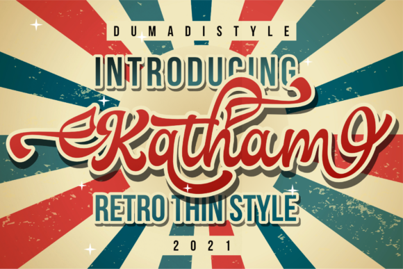
As a UI designer who ships dozens of landing pages, SaaS dashboards, and e-commerce experiences each year, I pay close attention to how typefaces shape perception before a single word is read. Katham stands out—not as background noise, but as intentional voice. It’s a retro-inspired script font with confident rhythm, subtle bounce, and clean terminal strokes that avoid the fragility common in handwritten fonts. Unlike overly ornate scripts that vanish on mobile or clash with modern interfaces, Katham balances personality with digital resilience.
Katham lives in the display font category—designed not for paragraphs, but for moments that need tonal clarity and visual punctuation. Its letterforms carry warmth and approachability without sacrificing polish. The lowercase ‘g’, ‘y’, and ‘f’ have gentle descenders that guide the eye downward; capitals have modest contrast and open counters, helping them hold up at smaller sizes than most script fonts. That makes Katham viable for hero section headlines, product name treatments, and even short CTA buttons—when used thoughtfully.
In practice, Katham shines where brand tone must be felt instantly. A boutique skincare brand uses it for “Glow Ritual” in their hero banner, paired with Inter for body copy—creating instant differentiation from clinical competitors. A creative coaching site applies Katham to section headers like “Your First Breakthrough” and “What Clients Say”, reinforcing human-centered messaging without relying on stock imagery. On portfolio sites, Katham elevates project titles (“Urban Rebrand”, “Seasonal Newsletter Kit”)—adding craft and intentionality that generic sans serifs can’t replicate.
Readability isn’t automatic—it’s engineered. Katham performs well across devices because its x-height is generous, spacing is open (especially in webfont versions), and kerning pairs are optimized for Latin-script languages. On mobile, I recommend using Katham at 28px minimum for headings and never below 24px—even with strong contrast. Avoid tight line-heights: 1.2–1.35 works best. For dark mode or image overlays, always test against your actual background tones. Katham’s medium-weight version maintains legibility over muted gradients better than ultra-thin variants, and its subtle ink-trail texture stays crisp at 72dpi and above.
Visual hierarchy benefits directly from Katham’s expressive weight. When placed above a clean sans serif like Manrope or a neutral serif like Literata, it immediately signals “this is the idea you’re here for.” That’s critical on conversion-focused layouts: a pricing page headline set in Katham draws attention before the user scans features or testimonials. In online stores, Katham on “Limited Edition Drop” banners creates urgency and exclusivity—without shouting. For blog graphics or email headers, it adds editorial flair while staying scannable in preview panes.
Font pairing is where Katham earns its keep. As a script font, it needs grounding. I consistently pair it with highly legible, low-contrast sans serifs for body text, navigation, and form labels—fonts with generous letterfit and clear punctuation. For more editorial or luxury-facing sites, a warm serif like Crimson Pro or Lora offers elegant contrast without competing. Never pair Katham with another decorative display font or a geometric sans with rigid corners—it disrupts rhythm. And skip all-caps usage unless the context is intentionally playful (e.g., a sticker-style badge); Katham’s charm lies in its natural flow.
Katham belongs to the Script Amp family of fonts—designed specifically for digital-first applications. It ships with OpenType features including stylistic alternates, ligatures, and small caps, giving designers flexibility without switching families. Webfont files include WOFF2 for optimal loading, and variable weight support means smoother transitions in interactive states. Multilingual support covers Western, Central, and South European languages—including accented characters used in French, Spanish, German, and Portuguese branding—so it scales with global audience needs.
Licensing matters in production. Katham is a commercial font, meaning it’s cleared for use across client websites, SaaS platforms, online store themes, digital templates, and branded assets—as long as the license covers web embedding. Always verify whether your plan includes unlimited domains or requires per-site activation. For agencies, bundling Katham into design system kits or Figma libraries is permitted under extended licenses, but redistribution (e.g., selling it inside a WordPress theme) isn’t. When exporting static assets like social media graphics or PDF pitch decks, Katham renders cleanly—no fallback surprises.
Where Katham works best: hero titles, logo lockups (as secondary wordmarks), testimonial quotes, course module names, limited-time offer banners, newsletter headers, and digital brand kits. Where it doesn’t: paragraph text, data tables, form inputs, navigation menus, or any UI element requiring rapid scanning. Think of it as your typographic accent wall—not the drywall.
I’ve seen Katham transform a generic course sales page into something that feels handcrafted and trustworthy—simply by replacing a default heading font with Katham and adjusting spacing to let its curves breathe. It communicates care, creativity, and confidence in under two seconds. That’s rare in modern typography. For designers building digital products where brand identity and user trust go hand-in-hand, Katham isn’t just another typeface. It’s a deliberate tool—one that earns its place in the design system, not just the font menu.